103. Flex-Direction
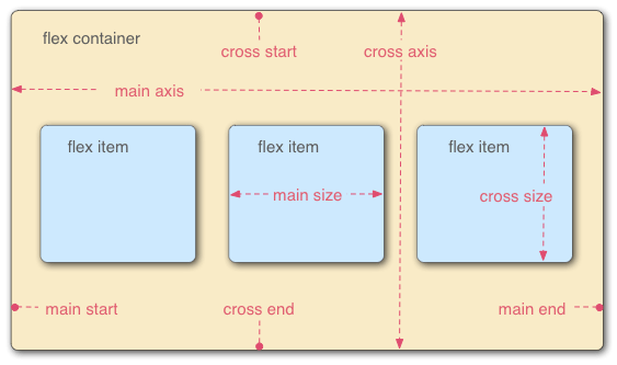
어떤 container의 attribute display를 flex로 설정하면 flex model을 사용할 수 있다.
기본적으로 main axis 방향인 좌우로 item들이 쌓이고, 축을 바꿀 수도 있다.
attribute flex-direction은 main axis의 방향과 main start 지점을 바꾼다.
flex-direction: row (default) / row-reverse (아래 -> 위) / column (좌 -> 우) / column-reverse (우 -> 좌)


104. Justify-Content
main axis를 기준으로 item를 어떤 위치에서 어떤 방식으로 둘지를 지정한다.
justify-content: flex-start (main start 부터) / flex-end (main end부터) / center (중간) / space-between (item들의 gap을 동등하게) / space-around (container의 좌우까지 고려하여 gap을 줌, item 사이의 거리가 container와 item 사이의 거리의 2배 / space-evenly (container의 좌우까지 고려하여 gap을 동등하게 줌)

105. Flex-Wrap
item의 크기가 container을 넘어설 때 container의 크기에 맞게 item를 조정하는 것이 아니라(default), main axis를 따라 item이 배치되다 item을 둘 자리가 없을 때 cross-axis를 따라 다음으로 넘어가서 배치된다.
이때, item를 cross start부터 둘지 cross end부터 둘 지를 결정한다.
flex-wrap: nowrap / wrap (cross start 부터) / wrap-reverse (cross end부터)

106. Align-Items
cross axis 방향으로 어떤 기준으로 align 할지를 결정한다.
align-items: flex-start (cross start에 맞춰서) / flex-end (cross end에 맞춰서) / center (cross start와 cross end 중간) / baseline (글자의 baseline을 맞춤)

107. Align-Content & Align-Self
Align-Content: item들이 두 줄 이상일 때, cross axis 방향으로 어떤 기준으로 align 할지를 결정한다.
align-content: flex-start / flex-end / space-between / space-around

Align-Self: item 하나만 align 하고 싶을 때
align-self: flex-start / flex-end / center / stretch

108. Flex-Basis, Grow & Shrink
Flex-Basis: main axis 방향으로, 기본 폭
Flex-Grow: main axis 방향으로 여백이 있을 때 얼마나 늘릴지 결정
Flex-Shirink: main axis 방향으로 container의 폭보다 item들의 폭이 더 넓을 때 얼마나 줄어들지 결정
110. Responsive Design & Media Queries Intro
meday query를 이용하여 display의 크기에 따라 css 설정을 다르게 줄 수 있다.
111. The Power of Media Queries
display 설정을 통해 기존에 있던 element를 숨기고 새로운 element를 보일 수도 있으며 flex를 block으로 바꾸거나 flex-direction의 방향을 바꿔 화면이 작아졌을 때 수직으로 쌓을 수도 있다.
'Web Development > CSS' 카테고리의 다른 글
| 9. Other Assorted Useful CSS Properties (0) | 2022.03.16 |
|---|---|
| 8. The CSS Box Model (0) | 2022.03.15 |
| 7. The World of CSS Selectors (0) | 2022.03.15 |
| 6. CSS: The Very Basics (0) | 2022.03.15 |


댓글